Learn A11y with FrontendMentor: Interactive Pricing
Build accessible slider and switch button


Introduction
In this article, we're going to build a pricing card. Looking at the design, it may seem simple. However, implementing functional accessibility features to some elements is challenging.
Although I was having a rough time building them and finding resources, I can guide us in implementing them in this article.
Let's get started.
What are we building?
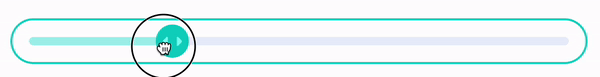
Pricing Range Slider
The first component we will build is this slider.

Don't be fooled by its looks. I'm guilty of it myself. Styling is challenging as there's yet to be a standard way to do it.
Firstly, let's create the markup.
<input type="range" name="pricing-slider" id="pricing-slider" class="slider" />
<label for="pricing-slider" class="sr-only">Price Range</label>
Notice that we hide the label because there's no visible label in the design. We use the sr-only utility class, which the previous two articles already covered.
Styling
We already set up the markup, so now we proceed to style the slider. Styling the slider can be complicated as there is no standard way to style it.
The most important thing when custom styling is removing the default appearance.
Important. We won't go too deep in styling as there're articles that explain it in detail better. Please see this article .
How to Fill the Track?
Using CSS background-image in combination with Javascript can give a filled line style when styling the slider.
We can give an arbitrary height and color to the input. It will create a custom track.

Unlike the browser's default styling, we can see no filled line to the left side. We can achieve that with Javascript.
We will set the background-image to create the filled track. The background-image will automatically be on top of the slider tracks.
Here is the CSS.
.slider {
  -webkit-appearance: none; /* Hides the slider so that custom slider can be made */
  appearance: none;
  width: 100%; /* Specific width is required for Firefox. */
  background-size: 50% 100%; /* Initial fill width in the center */
  background-repeat: no-repeat;
  background-image: linear-gradient(hsl(174, 77%, 80%), hsl(174, 77%, 80%));
}
We can modify the 'background-image' width and height with background-size. That means we can dynamically manipulate the filled track width based on our slider value with Javascript.
// Get the slider element
const pricingSlider = document.querySelector('input[type="range"]');

someEL.addEventListener("input", () => {
  // Get the value on change
  const formData = new FormData(form);
  const rangeVal = formData.get("pricing-slider") as string;

  // Extract the needed value for percenetage calculation
  const min = Number(pricingSlider.min);
  const max = Number(pricingSlider.max);
  const sliderVal = Number(pricingSlider.value);

  const sliderGradientPercentage = `${
    ((sliderVal - min) * 100) / (max - min)
  }% 100%`;

  // Set the `background-size` dynamically
  pricingSlider.style.backgroundSize = sliderGradientPercentage;
});
Here is the result
Clearer Slider Value with aria-valuetext
Our slider works as intended. However, we can further enhance it. However, the slider values are vague. It will announce whatever the value is in the HTML.
In our case, the slider should announce the price with the pageviews we get. For example, '500k pageviews for $16 per month'.
We can modify the announced values by using aria-valuetext. It will tell the text we set to it. So, we must dynamically update the aria-valuetext in Javascript when the slider's value changes.
In the guide, we must also set the ariaValueNow with the range actual value to use aria-valuetext.
Here is an example.
// inside an "input" event handler
pricingSlider.ariaValueNow = rangeVal;
pricingSlider.ariaValueText = `${pageViews} page views for ${price} per month`;
For more details, check it out on MDN
Billing Frequency Switch
The second element we will tackle is the switch.

Building a Switch with Radio Input?
Looking at the design, we expect to change the switch's state by receiving a mouse click or tap on the two labels on the opposite end.
My first instinct was to use switch role. It sounds reasonable but lacks the interactivity we need on both labels because the switch role only works with a single label.
Fortunately, I found a great article with the solution for our switch button. It styles <input type="radio"/> as a switch button, which makes sense and is accessible.
We must look out for challenging styling when using the radio. We must be creative in handling the radio's positioning and focus area to remain accessible.
I prefer the approach of this article that use an extra span inside the switch. It also means we have to hide the span from screen reader users.
Focus Ring
Currently, our switch is working great. However, we don't have any indication that we're interacting with the switch when we traverse by a keyboard.
We can improve the user experience. We should give an indicator, such as a border or outline on focus.
Since we only want the indicator visible when we use a keyboard, we use :focus-visible CSS state selector.
.switch-thumb:focus-visible {
  outline: 2px solid black;
  outline-offset: 4px;
}
Now, we have an excellent indicator and user experience improvement.

Discount Text
We can make another improvement. Let's look at the discount badge on the yearly billing label.
Currently, a screen reader will read the label as it is. 'Yearly Billing, -25%' gives few contexts. What is the '-25%'?
We can hide the badge's original text from assistive technologies and define the more informative text, which we hide visually.
<label for="yearly-radio" class=""
  >Yearly Billing /* Insert our more informative text */
  <span class="sr-only">with 25% discount</span>

  /* Hide the discount badge's text*/
  <span aria-hidden="true"> -25% <span>discount</span></span>
</label>
Now, screen readers will read the label as 'Yearly Billing with 25% discount'.
Bonus: Format Number and Currency with Intl
Some text has a particular format in the design, such as currency and pageviews.

Many developers hardcode the format or create logic to define it dynamically. Although their solutions work, it won't be easy to handle localization. So, there are better ways to tackle it.
Thankfully, Javascript has a built-in API that can handle basic to some advanced formatting tasks. It's called Intl. I will go through it quickly since it's a bonus.
Let's use it to format the currency.
const formatPrice = (price) => {
  Intl.NumberFormat("en-US", {
    // Set to "currency" for currency
    style: "currency",
    // Set the type of currency such as "USD", "JPY", and "CNY".
    currency: "USD",
    // Define how will we display the currency.
    currencyDisplay: "narrowSymbol",
  }).format(Number(price));
};
Format the pageviews too.
const formatViews = (views) =>
  Intl.NumberFormat("en-US", {
    // Define how we want to notate the number
    notation: "compact",
  }).format(views);
Finally, assign the formatted text to their respective elements.
const price = 1000;
const pageviews = 500000;

priceEl.innerText = formatPrice(price); // $1000
pageViewEl.innerText = formatViews(pageviews); // 500k
Recap
In this article, we've covered implementing accessibility to two complex interfaces. It can guide you to the right path when building such an interface.
To sum up:
Build a Pricing slider with Custom styling and Javascript.
Build a two-labeled switch with radio input.
Format currency and number with
IntlAPI.