Inclusive React Component: Todo List, Toggle Button, & Switch
Let's make everyone can use the web with React


When making an app, we get into code and solve problems most of the time. We focused on that cool feature. Finally, our app is finished. We are happy.
However, most developers forgot that we build the app for others.
We built it without thinking about how others will use the app. We naively thought that our users will use the app the way we intended to. We forgot that people may have disabilities that force them to use the app differently.
I spent quite some time trying to learn web accessibility and undoubtedly, it’s hard. There are not a lot of resources that are out there, let alone for building specific and complex interfaces. You are kind of must figure it out on your own. Maybe this is the reason people don’t care. It seems hard and it feels like we are not progressing with our app.
So, this motivates me to share what I’ve learned and increase the awareness of accessibility.
I chose React over vanilla Javascript because most of the resources online are in Javascript. I don't see a lot of React, which is weird because React is so popular.
In this blog post, we will build three common components from scratch and make them accessible.
This blog will focus more on the accessibility side. So, we won’t go too deep on React and styling. I won't provide the styling here, but you can surely check out the repo or live demo
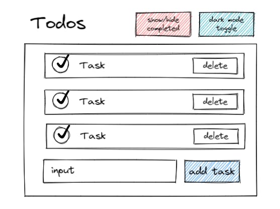
To-Do List
The first component is a to-do list. We all have made it to practice as a beginner. It’s nice and easy but not many are accessible. So, what is a better way than starting with it?
Here is my design.
To-Do List Region
A typical to-do list can consist of a list, filters, an add item form, etc. We can organize all of them into a group. Organizing into region or group give users clarity on where they are currently in our app.
Why region? because region can give you contextual information when the screen reader enters it.
There are two ways to create a region, either by using <section /> or <div />. We will use <section />. It is important to give the region an accessible name (e.g., heading and aria-label).
Most people use sections recklessly without giving an accessible name. So, it will be identified as a generic element in the accessibility tree. Section should be used when there is no more specific element to represent a structure.
according to WebAIM, 68.8% of screen reader users primarily use heading to navigate by pressing 1 – 6 or
hkey.
<section aria-labelledby='todo-heading'>
      <h1 id='todo-heading'>My Accessible Todo List</h1>
<section/>
To associate the section with a heading, we used aria-labelledby. aria-labelledby gives us the power to create a relationship by assigning its id to the element we want to associate. Remember that aria-labelledby naming will take precedence over other labeling methods (e.g. aria-label, <label /> ).
Now, when screen readers enter a to-do item inside the region, it will announce ‘My Accessible Todo List, region.’
List
We need a state to hold the todos and create a seed to populate the todos. We are going to use a simple interface for the data. After that, we map over todos to create a list.
const TODO_SEED = [
  { id: '1', name: 'Learn Remix', completed: false },
  { id: '2', name: 'Get groceries', completed: true },
];
function TodoList {
const [todos, setTodos] = useState(TODO_SEED);
return (
  <ul>
    {todos.map((todo) => (
      <li key={todo.id} id={todo.id}>
        <input type="checkbox" id={id} />
        <label htmlFor={id}>{todo.name}</label>
        {todo.name}
      </li>
    ))}
  </ul>
);
}
We are going to ignore the checkbox and completed state for now.
To-Do Empty State
What do you think we will see when there is no item on our list? That’s right, nothing but blank space. The problem with displaying nothing is when we insert a new to-do, the layout of the list will shift and seems unfamiliar. Unpredictable layout shifts can annoy and confuse someone, especially people with cognitive disorders.
Here is when the empty state comes into the spotlight. It acts as a placeholder for an element that gives context to what the future content is.
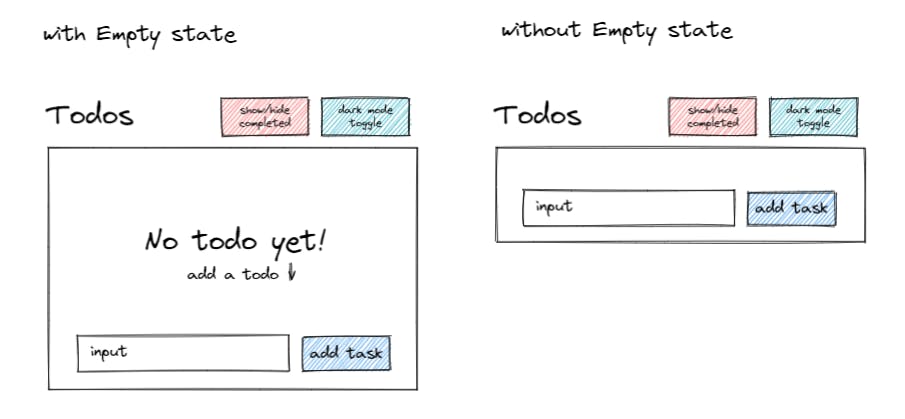
So, let’s add an empty state to our to-do list by conditionally rendering it when the list is empty.
return todos.length > 0 ? (
  <ul>
    {todos.map((todo) => (
      <li key={todo.id} id={todo.id}>
        <input type="checkbox" id={id} />
        <label htmlFor={id}>{todo.name}</label>
        {todo.name}
      </li>
    ))}
  </ul>
) : (
  <div>
    <p>
      <span> No todo yet</span>
      <span>add your first todo ⬇</span>
    </p>
  </div>
);
Adding To-Do
Now that our list is ready, let’s add the form to create a new to-do.
<form>
          <input
            type='text'
            placeholder='e.g. watch family feud'
            required
            id='add-task'
          />
          <label htmlFor="add-task" className='sr-only'>
            Add todo
          </label>
          <button type='submit'>add todo</button>
  </form>
In our initial design, there is no label anywhere for the input field. But, we still want to label the input field without text taking up space on the page.
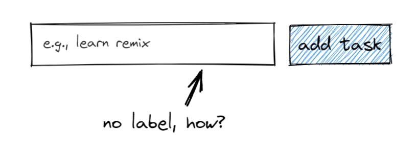
So, we do a workaround which visually hide the label, but still accessible to screen readers. We achieve that by attaching sr-only (naming borrowed from Tailwind) class to the label element.
.sr-only {
  position: absolute;
  width: 1px;
  height: 1px;
  padding: 0;
  margin: -1px;
  overflow: hidden;
  clip: rect(0, 0, 0, 0);
  border: 0;
}
On top of that, we give extra context visually by adding a placeholder to the input field.
Why not use display: none or visibility: hidden ?
display: nonemeans the element will be removed from the accessibility tree. Thus, can’t be used to label as it literally doesn’t exist.visibility: hiddenmake the element invisible, but still takes up space as normal. Also, it will remove the element from the accessibility tree.
Now, let’s add React to our form.
const [todoInput, setTodoInput] = useState('')
const createTodo = (e) => {
    e.preventDefault();
    const newTodo = {
      id: String(Date.now()),
      name: todoInput,
      completed: false,
    };
    setTodos((prevTodos) => [...prevTodos, newTodo]);
    setTodoInput('');
  };
//...
<form onSubmit={createTodo}>
        <input
          type='text'
          placeholder='e.g. watch family feud'
          required
          id='add-task'
          value={todoInput}
          onChange={(e) => setTodoInput(e.target.value)}
        />
        <label htmlFor='add-task' className='sr-only'>
          Add todo
        </label>
        <button type='submit'>add todo</button>
  </form>
We use the form element because by some screen readers, users will be informed when entering a form. When users of screen readers like JAWS or NVDA encounter an element, they are automatically entered into a special interaction mode variously called “forms mode” or “application mode”.
~ Inclusive Components by Heydon Pickering.
Form makes submitting easier with the button inside it by enabling us to submit by pressing enter. We just need to add type="submit" to the submit button and listen for a submit event.
Deleting To-Do
After we can add a task, we need a way to delete it. We are going to implement a delete button with icon.
<button type='button'>
        <span className='sr-only'>delete {todo.name}</span>
        <svg
          xmlns='<http://www.w3.org/2000/svg>'
          height='1.5rem'
          width='1.5rem'
          viewBox='0 0 20 20'
          fill='currentColor'
          aria-hidden='true'
        >
          <path
            fillRule='evenodd'
            d='M9 2a1 1 0 00-.894.553L7.382 4H4a1 1 0 000 2v10a2 2 0 002 2h8a2 2 0 002-2V6a1 1 0 100-2h-3.382l-.724-1.447A1 1 0 0011 2H9zM7 8a1 1 0 012 0v6a1 1 0 11-2 0V8zm5-1a1 1 0 00-1 1v6a1 1 0 102 0V8a1 1 0 00-1-1z'
            clipRule='evenodd'
          />
        </svg>
   </button>
Here is what we did to make an accessible icon button.
- Hide the image or icon from the screen reader by setting
aria-hidden="true". Alternatively, we can just set the alt text to an empty string. - Give our button an accessible name. We created a visually hidden span with the button’s text. Notice that we also inform screen readers what item will be deleted.
You might wonder, why we assign type="button" to a button? It’s because buttons defaulted to type submit that will trigger form submission on pressing enter.
It’s not our intended behavior. So, we set type="button" to prevent this default.
Now, let’s refactor our to-do item into its own component. Then, wire the to-do item with deleteTodo function. We will manage the state and logic on the parent component.
const deleteTodo = (id) => {
    setTodos((prevTodos) => prevTodos.filter((todo) => todo.id !== id));
  };
...
{todos.length ? (
        <ul >
          {todos.map((todo) => (
            <TodoItem
              key={todo.id}
              id={todo.id}
              name={todo.name}
              completed={todo.completed}
              deleteTodo={deleteTodo}
            />
          ))}
        </ul>

const TodoItem = ({
  id,
  name,
  completed,
  deleteTodo,
}) => {
  return (
    <li>
      <input
        type='checkbox'
        id={id}
        defaultChecked={completed}
        onChange={handleToggle}
      />
      <label htmlFor={id}>
        {name}
      </label>
      <button
        type='button'
        onClick={() => deleteTodo(id)}
      >
        <span className='sr-only'>delete {name}</span>
       //svg omitted for brevity
      </button>
    </li>
  );
};
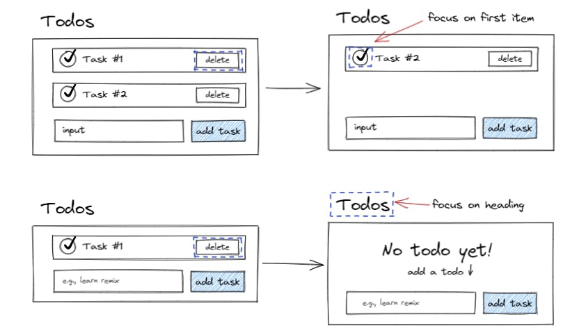
Our delete button is working beautifully. However, it lacked something. What do you think will happen when keyboard users delete a to-do? Yep, the focus is thrown to nothing as our delete button is gone. It will be confusing for users, especially screen reader users.
So, let's introduce focus management. Here are our goals.
- If there is still an item in the list, we pass the focus to the first item. It’s nice since screen readers will announce the list item with the item count in the list.
- If there is no item left, we pass the focus to the list heading.
When doing focus management, we should do it inside useEffect to make sure our component has re-rendered before we manipulate the DOM.
We can surely do it in the event handler directly, but it doesn’t make sense since mutating ref is a synchronous action. Our targeted element will be focused before the state even change which can cause bugs and confusion. For screen readers, it means that the announcement can happen too early.
Now, we need to distinguish types of actions to know which element to target inside useEffect. We add a new state called action that tells us are we deleting, creating, or editing.
Let’s update accordingly.
const [action, setAction] = useState(null); // no action when mounted

const deleteTodo = (id) => {
    setAction('delete');
    setTodos((prevTodos) => prevTodos.filter((todo) => todo.id !== id));
  };
const createTodo = () => {
//Create logics are omitted for brevity
        setAction('create');
}
Inside useEffect we can do the focus management of deleting an item.
useEffect(() => {
    if (action === 'delete') {
        let elementToFocus;
      if (todos.length === 0) {
        elementToFocus = document.getElementById('todo-heading')
      } else {
        elementToFocus = document.querySelector('.list input[type="checkbox"]');
      }
      elementToFocus?.focus();
    }
  }, [action, todos]);
We check are we deleting? If yes,
- If the container is empty, focus on the heading.
- If there is an item in the list, focus on the checkbox of the first item.
This action state might seem redundant. But, it pays off when there are more actions and complex states, it can help to distinguish the actions easily.
After we set up the focus management, we still need to make our heading focusable. We can do that easily by adding tabIndex={-1} to the heading.
What do tabIndex values mean.
- -1 means the element focusable programmatically i.e., the focus can only be done with our code.
- 0 means the element is added to focus order and can be focused when users use tab key.
- Any tabIndex greater than 0 is not recommended and considered anti-pattern because it could cause disorder in a page’s focus order.
Be cautious not to add tabIndex recklessly to non-interactive components as focus means that the element is activated and can do something. In our case, it’s fine because we have a valid reason.
<h1 id='todo-heading' tabIndex={-1}>My Accessible Todo List</h1>
Check off To-Do
It’s about time to handle toggle completed on our to-do items. We use checkbox because it matches our need to check and uncheck something. We already have it on our code, so let’s wire state and handler.
const TodoItem = ({id,name, completed, deleteTodo, toggleTodo}) => {
//...
<input
        type='checkbox'
        id={id}
        defaultChecked={completed}
        onChange={() => toggleTodo(id)}
      />
      <label htmlFor={id}>
        {name}
      </label>

//parent.jsx
const toggleTodo = (id) => {
    setTodos((prevTodos) => {
      const updatedTodos = prevTodos.map((todo) => {
        if (todo.id === id) {
          return { ...todo, completed: !todo.completed };
        }
        return todo;
      });
      return updatedTodos;
    });
setAction("toggle")
  };
Remember that checkboxes must have a label to identify them. Screen readers will read the label along with the focused checkbox. Additionally, the label expands its input field activation area. We can say that label is an area extension of an input field.
Don’t prevent default a checkbox because it will prevent it from being toggled. Checkbox doesn’t cause form submission. Preventing default is useful when the element causes unintended behavior.
Accessibility is useful, right?
Feedback
Now, our to-do list is good and accessible. Its accessibility is fine, but screen readers support can be better. When a visually impaired screen reader user adds a to-do item or deletes a to-do item, there is no auditory feedback that tells the action is successful. Users might think “Was my item added to the list or did other things happen?”
They will never know until they traverse our app again. What an annoying and cumbersome experience. Luckily, we have live region that can give screen readers an announcement when something changed in our app. The live region could be implemented on notification, confirmation, etc.
We can trigger the live region announcement by modifying, adding, or removing the content in it. Live region default is to announce when content is added. If we want to change the default, we can set the aria-relevant to “removals”, “all”, “additions”, or “text”.
We will visually hide our live region because we just want it for screen readers.
Now, we want to give users feedback when a to-do is successfully added. So, they can add more items or do other things without hesitation. Let’s modify our form and create a live region.
const liveRegionRef= useRef('')

const createTodo = (e) => {
    //...omitted for brevity
    setTodos((prevTodos) => [...prevTodos, newTodo]);
    setTodoInput('');
      liveRegionRef.current= todoInput;
  };
...
<form onSubmit={createTodo}>
        <span
          className='sr-only'
          role='status'
          aria-live='polite'
        >{liveRegionRef.current}</span>
//... omitted for brevity
What’s happening there.
- We add
aria-live=”polite”to indicate that it is a live region. Also,role=’status’is added too for cross-browser compatibility. It might seem redundant, but it’s helpful. - We initialize a ref to hold the text for the feedback. We use ref because we want to update the value immediately when the state changes.
- We add an
sr-onlyclass to visually hide the content. - We place the live region above the form, but we can put it anywhere, really.
Now, our form has feedback that announce ‘Added sleep’ to screen readers when sleep is added. Let’s add feedback for deleting a to-do too.
 const deleteTodo = (id, todoName) => {
    dispatch({ type: 'delete', payload: id });
    liveRegionRef.current = `Deleted ${todoName}`;
  };
Don't forget to add the parameter to the handler in the to-do item component.
Toggle Button
We see this button everywhere, from show/hide password, dark mode toggle, play/pause, etc. So, what is a toggle button exactly? Based on WAI-ARIA authoring practice, a toggle button is a two-state button that can be either on (pressed) or off (not pressed).
Implementing an accessible toggle button is not hard. We just need to be careful with the gotchas. But, why not checkbox though? At first, it might make sense to use a checkbox. The problem with the checkbox is it’s associated with an input field. It means users might expect if they toggle the checkbox, they also inputted a value for submission somewhere.
We are going to create a toggle button that will hide/show the completed to-do in our to-do list.
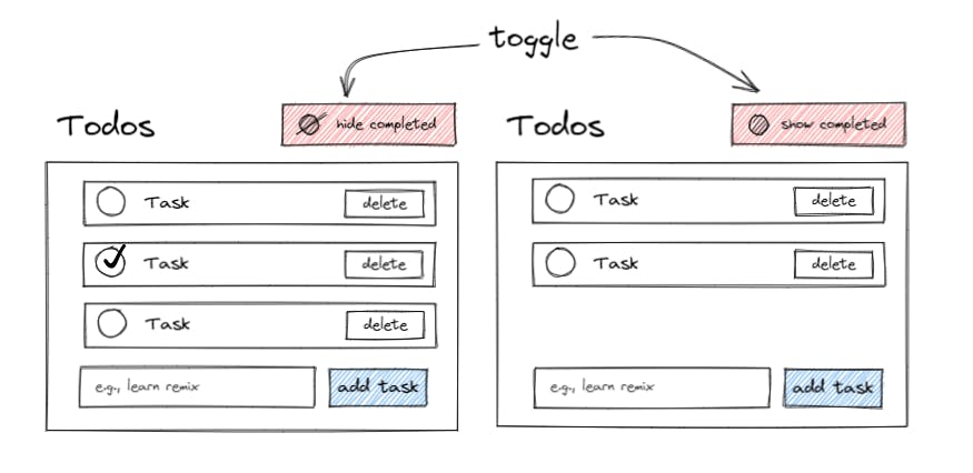
Let’s create a boolean state that will show on true and hide when false.
//parent.jsx
const [shouldShow, setShouldShow] = useState(true);
//...omitted
  <h1 id="todo-heading" tabIndex={-1}>
    My Accessible Todo List
  </h1>
  <ul>
    <li>
      <ToggleButton shouldShow={shouldShow} setShouldShow={setShouldShow} />
    </li>
  </ul>
//...omitted
We put it inside a list as we will have other controls. Now, we create the toggle button component.
const ToggleButton = ({ shouldShow, setShouldShow }) => {
  return (
    <button
      type='button'
      onClick={() => setShouldShow(!shouldShow)}
      aria-labelledby='todo-toggle'
    >
      {shouldShow ? <EyeHideIcon /> : <EyeIcon />}
      <span id='todo-toggle'>
        {shouldShow ? 'hide completed' : 'show completed'}
      </span>
    </button>
  );
};
const EyeHideIcon = () => {
  return (
    <svg
      aria-hidden='true'
      height='1.25rem'
      xmlns='<http://www.w3.org>
    /2000/svg'
      fill='none'
      viewBox='0 0 24 24'
      stroke='currentColor'
      strokeWidth={2}
    >
      <path
        strokeLinecap='round'
        strokeLinejoin='round'
        d='M13.875 18.825A10.05 10.05 0 0112 19c-4.478 0-8.268-2.943-9.543-7a9.97 9.97 0 011.563-3.029m5.858.908a3 3 0 114.243 4.243M9.878 9.878l4.242 4.242M9.88 9.88l-3.29-3.29m7.532 7.532l3.29 3.29M3 3l3.59 3.59m0 0A9.953 9.953 0 0112 5c4.478 0 8.268 2.943 9.543 7a10.025 10.025 0 01-4.132 5.411m0 0L21 21'
      />
    </svg>
  );
};

const EyeIcon = () => {
  return (
    <svg
      aria-hidden='true'
      height='1.25rem'
      xmlns='<http://www.w3.org/2000/svg>'
      fill='none'
      viewBox='0 0 24 24'
      stroke='currentColor'
      strokeWidth={2}
    >
      <path
        strokeLinecap='round'
        strokeLinejoin='round'
        d='M15 12a3 3 0 11-6 0 3 3 0 016 0z'
      />
      <path
        strokeLinecap='round'
        strokeLinejoin='round'
        d='M2.458 12C3.732 7.943 7.523 5 12 5c4.478 0 8.268 2.943 9.542 7-1.274 4.057-5.064 7-9.542 7-4.477 0-8.268-2.943-9.542-7z'
      />
    </svg>
  );
};
What’s happening there?
- We create a button with
type="button"to prevent the button from its default behavior. - We use icons with text, so we need to hide the icon from screen readers by adding aria-hidden=’true’.
- We toggle the show/hide state by clicking on the button.
- We choose
aria-labelledbyto label the button because screen readers won’t announce the change in the button’s text by default. To be announced, users must focus and refocus manually.
Pretty simple right? Go ahead and try our toggle button. Yep, it doesn’t work. Don’t panic, it’s just that we didn’t update the to-do list when the state changed.
Here you go.
// parent.jsx
const filteredTodos = shouldShow
    ? todos
    : todos.filter((todo) => todo.completed === false);
...
{filteredTodos.length ? (
        <ul>
          {filteredTodos.map((todo) => (
            <TodoItem
              key={todo.id}
              id={todo.id}
              name={todo.name}
              completed={todo.completed}
              deleteTodo={deleteTodo}
              toggleTodo={toggleTodo}
            />
          ))}
        </ul>
Remember that we don’t mutate the original todos array with filter.
Dark Mode Switch
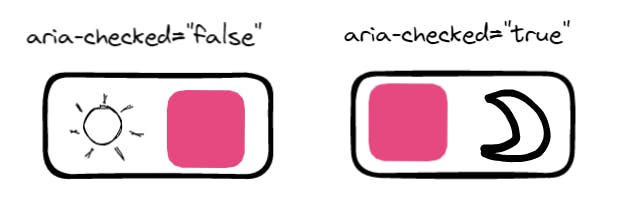
Our final component is a switch button. Switch has similar functionality to the toggle button. The difference is instead of the value being checked and unchecked, it’s on or off. Switch use aria-checked to know its state. Some screen readers will also give extra context and instruction when entering the switch.
Giving role="switch" will make its descendant have role="presentation" implicitly, which means the descendants will be hidden from screen readers. This behavior exists because accessibility API can’t correctly represent the semantic elements of the switch role.
To make an accessible switch button we must:
- Assign
role="switch"to a button. - Label/name the switch with a label to identify it.
- Handle the change of
aria-checkedstate when clicked.
We are going to build a dark mode switch for our to-do list. We place it in the to-do control list together with the toggle button.
const [mode, setMode] = useState('light'); // 'light' | 'dark'
...
<ul>
  <li>
    <ToggleButton shouldShow={shouldShow} setShouldShow={setShouldShow} />
  </li>
  <li>
    <DarkModeSwitch mode={mode} setMode={setMode} />
  </li>
</ul>

const DarkModeSwitch = ({ mode, setMode }) => {
  return (
    <>
      <button
        role='switch'
        id='dark-mode'
        className={style.switch}
        aria-checked={mode === 'dark' ? 'true' : 'false'}
        onClick={() => setMode(mode === 'dark' ? 'light' : 'dark')}
      >
        <span>
          <SunIcon />
        </span>
        <span>
          <MoonIcon />
        </span>
      </button>
      <label htmlFor='dark-mode' className='sr-only'>
        Dark mode
      </label>
    </>
  );
};

export default DarkModeSwitch;

const SunIcon = () => {
  return (
    <svg
      aria-hidden='true'
      xmlns='<http://www.w3.org/2000/svg>'
      height='1rem'
      viewBox='0 0 20 20'
      fill='currentColor'
    >
      <path
        fillRule='evenodd'
        d='M10 2a1 1 0 011 1v1a1 1 0 11-2 0V3a1 1 0 011-1zm4 8a4 4 0 11-8 0 4 4 0 018 0zm-.464 4.95l.707.707a1 1 0 001.414-1.414l-.707-.707a1 1 0 00-1.414 1.414zm2.12-10.607a1 1 0 010 1.414l-.706.707a1 1 0 11-1.414-1.414l.707-.707a1 1 0 011.414 0zM17 11a1 1 0 100-2h-1a1 1 0 100 2h1zm-7 4a1 1 0 011 1v1a1 1 0 11-2 0v-1a1 1 0 011-1zM5.05 6.464A1 1 0 106.465 5.05l-.708-.707a1 1 0 00-1.414 1.414l.707.707zm1.414 8.486l-.707.707a1 1 0 01-1.414-1.414l.707-.707a1 1 0 011.414 1.414zM4 11a1 1 0 100-2H3a1 1 0 000 2h1z'
        clipRule='evenodd'
      />
    </svg>
  );
};

const MoonIcon = () => {
  return (
    <svg
      aria-hidden='true'
      xmlns='<http://www.w3.org/2000/svg>'
      height='1rem'
      viewBox='0 0 20 20'
      fill='currentColor'
    >
      <path d='M17.293 13.293A8 8 0 016.707 2.707a8.001 8.001 0 1010.586 10.586z' />
    </svg>
  );
};
Our button is now working. The state management is practically like a toggle button. We still need to style it though, so it looks like a switch. We can style it by using its aria-checked attribute in CSS.
Here is the implementation.
.switch {
  position: relative;
  display: flex;
  align-items: center;
  gap: 1rem;

  border: gray solid 1px;
  border-radius: 5px;
  padding: 0.25rem;
}

.switch[aria-checked='false']::after,
.switch[aria-checked='true']::after {
  position: absolute;
  z-index: 10;
  content: '';
  width: 45%;
  height: 90%;
  border-radius: 3px;
  background-color: #ff0a78;
  top: 50%;
  transform: translateY(-50%);
}

.switch[aria-checked='false']::after {
  right: 5%;
}
.switch[aria-checked='true']::after {
  left: 3%;
}
How to implement the dark mode colour switch? We won’t go deep, but we utilize CSS custom properties.
:root {
  --bg-primary: white;
  --bg-secondary: black;
  --text: black;
  --input: white;
}

.dark {
  --bg-primary: #0e151a;
  --bg-secondary: #ff0a78;
  --text: white;
  --input: #20282e;
}
We can conditionally add the dark class to the container to change the custom properties color based on the mode.
Make sure the color contrast is sufficient. The easiest way is to audit the page using lighthouse. It will tells all failing elements.
Conclusion
Yaaay!! It’s the end.
We have created 3 components that are commonly encountered in the wild and turn them accessible.
I hope all of you can benefit greatly from this article.
Big thanks to Heydon Pickering for authoring great books on accessibility. His books inspires me a lot.
By no means I’m an expert in this area. Mistakes are bound to be made. So, if you got something, please reach out to me. I appreciate all feedback and criticism.
Thank you for coming this far with me. I sincerely thank you from deep inside my heart.