
Photo by Daniel Ali on Unsplash
Let's Fix It: Can't Use My Own Site
An Enlightenment on Web Accessibility


You might be wondering what I'm talking about. How could you make a site that you can't even use? What's the point of making it in the first place then? Relax... I'm talking about web accessibility. You can still access my site with a mouse without any problem.
The problem is when you use your keyboard, the main content is totally ignored. Let alone assistive device users (e.g. screen reader), What a mess😩.
That example is only the tip of the iceberg. There are a lot more problems even Lighthouse can't detect, deceivingly leading me to believe that my site is accessible. Fortunately, I got exposed to accessibility before, through videos and articles. I just didn't care enough back then.
So, I'm going to try to solve it and document it in this article. Hoping I can help someone get started. Let's go!!
For your information, I am using:
- Remix (React framework)
- Tailwind CSS (styling)
- NVDA (screen reader)
- AxeDevtools and Lighthouse (accessibility testing)
Color Contrast
Color contrast is relatively easy to fix and the most frequently fail on my site. However, it can be tricky to fix when you have to adhere to a brand color that doesn't have enough contrast.
On my site, I fix it by adjusting the color shade. A piece of advice on color contrast is to use off-white and off-black colors. The reason is that high contrast can cause eye strain during a long reading period.
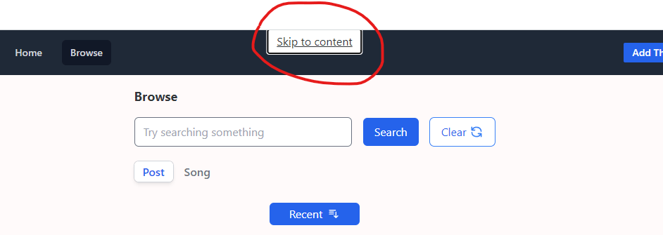
Bypass Block or Skip Link
A need for skip link arises from screen reader users that use keyboards for navigation. Every page changes, user's keyboard focus is thrown to the top of the document, which means users must traverse through your site navigation to access the main content. It is tedious and repetitive.
The solution is to create a hidden link placed before the navigation, which is shown on focus by the keyboard. The link will navigate users straight to the place you intended, most likely the main content.
Here is my implementation
import { Link } from "remix" //same "Link" from react-router-dom

<body>
<Link className="fixed left-1/2 top-0 z-30  -translate-x-1/2 -translate-y-full bg-white px-3 py-1 underline  transition-transform focus:translate-y-0"
        to="#main">
  Skip to content
</Link>
<header><nav>//contents</nav></header>
...
<main id="main" >
//omitted for brevity
</main>
Page must contain a level-one heading (h1)
This rule is considered best practice. h1 allows screen readers to skip navigation directly to it using a keyboard shortcut. If there is no h1, screen reader users must listen to more of the site content to understand the site structure which wastes a lot of valuable time.
To solve the problem, put an h1 tag before the main content. You must only put a singleh1 on a page.
All Page Content Must be Contained by Landmarks
This rule is considered best practice. Landmarks allow screen reader users to navigate your page using landmarks. Landmark is high-level sectioning of your contents either by using semantic HTML or adding a role attribute to an HTML element. Some landmark examples are <main>, <header>, <form> and <footer>. Content outside a landmark is difficult to find and the purpose may be unclear.
On my site, I got a few of these problems. To fix it, I move all the content into landmarks that it supposes to belong.
Search Input Live Region
Search input has no indication of state changes for screen reader users. Therefore, when they are searching, they won't know whether the site is busy searching, done searching, or even fail.
To improve the search experience, I added a live region only available to screen readers. The live region will announce a message based on the search state.
 <span className="sr-only" aria-live="polite" role="status">
          {fetcher.state === 'submitting' || fetcher.state === 'loading'
            ? 'Searching...'
            : fetcher?.data?.length >= 0
            ? `${fetcher.data.length} songs found`
            : ''}
        </span>
Focus on Heading on Page Changes
On page changes, usually, we want to give focus to a focusable element that leads to action. For example, on the search page, we give the initial focus to the search input element.
The focus enables users to:
- start typing immediately
- save time from navigating
As a bonus, screen reader announce whatever we focus on, which give alert to visually impaired users on page change. However, there are some pages with no focusable element. To handle the problem, I created a useFocusToHeading hook.
import { useEffect } from 'react';
export const useFocusToHeading = () => {
  useEffect(() => {
    const headingElement = document.querySelector('h1');
    headingElement.focus();
  }, []);
};
The hook will find an h1 element on the page, then give it a focus. An important note, h1 isn't inherently focusable. So, we have to give h1 a tabindex='-1' attribute to make it focusable programmatically.
Pagination with Load More Button
While I was testing the pagination feature, I noticed a problem that can be detrimental to the user experience. When I click the load more button, the focus stays on the button even after the content is updated. For screen reader and keyboard users, the experience is annoying.
I thought it is better to focus on the first loaded content on the list, which means :
- screen readers will announce the new content in the list.
- keyboard users will be able to immediately traverse through the new content.
Hence, I created yet another hook called useFocusOnFirstLoadedContent.
const useFocusOnFirstLoadedContent = list => {
    useEffect(() => {
      if (list.length === 0 || !list) return;
      const listLengthDivided = Math.floor(list.length / 10) - 1;
      const contentToFocus =
        listLengthDivided === 0
          ? document.getElementById('link-0')
          : document.getElementById('link-' + String(listLengthDivided * 10 + 1));
      contentToFocus?.focus();
    }, [list]);
  };
Login and Registration Form
Initially, I handle my site login and registration form in a /login route. I use a fieldset with two radio buttons and a react state to switch between login and registration. I thought it was good as I didn't really care about form.
Ohh.. how wrong I was when I started researching how to make a form accessible.
Problem and Solution
<Form> Isn`t Identified as a Landmark in the Accessibility Tree
The <Form> is identified as a 'section' which means screen readers can't tell users that they are inside a form. Users will arrive at a form field without knowing what the field's purpose is.
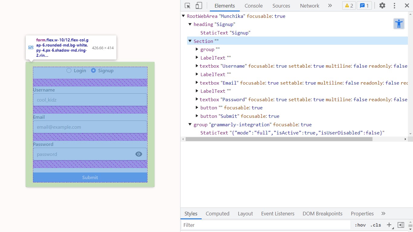
Fortunately, I just need to label the form with the h1 on the page.
import { Form } from 'remix'

 <h1 id="form-name">Login</h1>
 <Form aria-labelledby="form-name" method="post">
aria-labelledby forms a relation between h1 and <Form>. Now, <Form> will have the name 'Login' and screen reader can access the form landmark.
Separating Login and Registration
When testing the login page with NVDA, It was confusing to switch forms using radio buttons.
Form type is ambiguous and it is hard to tell what the radio buttons' purpose is. So, I delete the radio buttons and create a new form on the /registration route.
Now, another problem emerges. How to switch between those two pages? Easy enough, I put a link next to the usual login page phrase 'Already have an account?' which will be placed under the submit button. However, after reading Form Design Patterns by Adam Silver, It's better to put the phrase before the form. Why? because visually impaired people who use screen readers will expect that the submit button marks the end of the form. Also, it tells them in advance that there are options.
Input Field Placeholder
In Form Design Patterns, there is a precaution on giving hints to users with placeholder. As you know, developers and designers love to use placeholder on an input field as a hint.
Things to consider when using placeholder:
- Placeholder text contrast is deliberately lower, which can cause readability issues. If we increase the text contrast, it can be mistaken as an input.
- Placeholder will be hidden when the field is focused. If we use placeholder as a hint (e.g. 'Password must be 8 characters long'), users can forget the hint as they are typing, forcing them to clear the input field. Especially for cognitively disabled users, remembering hints can be hard.
- Placeholder text longer than the input field will be cut off to accommodate the width of the input field. For example, a responsive page that has an input field's width relative to the viewport's width.
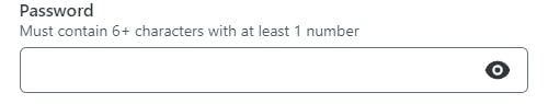
In Form Design Patterns, Adam Silver suggested to remove the placeholder and put the hint inside the input's <label>, under the label's text as a <span>.
<label htmlFor='password' className='flex flex-col items-start'>
<span>Password</span>
<span>Must be at least 8+ characters</span>
</label>
<input type='text' id='password' />
NVDA will read the input field as 'Password, Must be at least 8+ characters, Input field, blank'
Initially, the solution was great because the hint is described upfront and as a bonus, the input's tap area is wider. But, I found it strange because <label> that contains too much information can be a hindrance to users.
Eventually, I choose an alternative given by the author which is to place the hint under the <label>, then connect the hint using aria-describedby.
<label aria-describedby='password-hint' htmlFor='password'>
Password
</label>
<p id='password-hint'>Must be at least 8+ characters</p>
<input type='text' id='password' />
The benefit of separating the hint from the label is that the label is more concise. Usingaria-describedby means that the hint will be read at the end as extra information.
NVDA will read the input field as 'Password, Input field, blank, Must be at least 8+ characters '
Form Validation Error
It is common to place an error message under the problematic field for validation. At first, that was enough. It turns out there is a lot more to handle an error message.
Here are considerations when creating an error message:
- Give the invalid input field an
aria-invalidattribute of 'true' on error. - Considering users with color blindness, we cannot rely on color and text alone as an error message. Colorblind users won't notice the difference immediately and might be confused. It is best to add an icon that indicates a warning (e.g. ⚠) to give the error message more visual representation.
- Considering screen reader users, there is no way for them to get informed of the error message currently. My preferred way is to connect the error message with its input field using
aria-errormessagewhich works the same asaria-describedby. - For the error message itself, add
aria-live='polite'so screen reader users are informed when the invalid field's error message content is shown or changes.
Here is an example implementation.
import { ExclamationIcon } from '@heroicons/react/solid';
//a basic example
 <input
        name='email'
        id='email'
        type='email'
        required={true}
        aria-describedby='email-hint'
        aria-errormessage='email-error'
        aria-invalid={fieldError ? 'true' : 'false'}
      />
 <p aria-live="polite" role="status" id='email-error'>
    <ExclamationIcon className="h-4" aria-hidden="true" />
<span>Email is already registered<span>
    </p>
Input Focus Management On Error
Focus management is an important part that is often overlooked by developers. I felt guilty for not implementing focus management before I learn accessibility. Focus management is particularly helpful for screen reader and keyboard users.
As an example, on validation error, we want the user's focus to be on the invalid field, so they can fix the error right away. Proper focus ensures a comfortable user experience.
On my site, I want to focus on the first invalid field from the top. Therefore, I created a useFocusOnError hook.
import { useEffect } from 'react';

export const useFocusOnError = (ref, fieldErrors) => {
  useEffect(() => {
    const form = ref.current;
    if (!form || !fieldErrors) return;
    for (const fieldName of Object.keys(fieldErrors)) {
      if (fieldErrors[fieldName]) {
        const errorField = document.getElementById(fieldName);
        errorField?.focus();
        break;
      }
    }
  }, [ref, fieldErrors]);
};
...
//fieldErrors example
const fieldErrors  = {
password: 'Password must contains at least 8 characters', //there is an error
email: undefined //no error
}
As parameters, the hook received ref from a form and fieldErrors object. fieldErrors is a response from the server that contains all the fields with its error message (if any). When invoked, the hook will loop through fieldErrors, then focus on the first invalid field it came across.
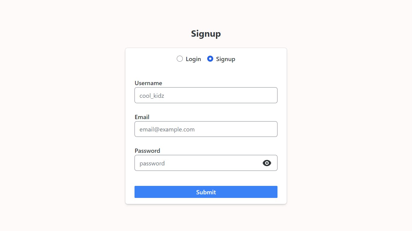
Form's Final Look
Post Card Component
On my site, this component is the biggest problem as it is unreachable. By unreachable, I mean screen reader and keyboard users. I am shocked the first time I tested it, the keyboard tabbing just skip over it from the navbar straight to the footer.
Making an accessible card is notorious for its trickiness, especially a card with a lot of interactive elements in it. On the internet, there is various kind of solutions and all of them are still debatable.
In my case, the card contains two interactive elements inside it, a link and a menu. I couldn't find any concrete solutions on the internet. So, I just go to the best of my ability and knowledge.
Problems and Solutions
Card Is Not Tabable by Keyboard
Initially, I just want the link inside the card to be tabable. But, I figure that I also want screen readers to read other content inside the card. The solution is to simply add tabindex='0' to the card container (e.g. li and div). Now, we can tab through each card individually using the keyboard.
The Card's Link Is a Card too
Here is the tricky part, this particular card contains an image and text linked to the song's feed. On the internet, a lot of solutions use a as a container. It works well for the interactivity and click area.
But, it will lose the semantics by wrapping block-level elements such as div and p, in an a which is an inline element.
To fix the problem, I wrap the card contents in a div and the link itself goes to the card's title. I use a 'hack' by manipulating the a's :after pseudo-class to make the whole card a clickable area.
import { Link } from 'remix'

 <div className="relative mb-4 flex items-center gap-4 rounded-sm shadow-md ring-1 ring-slate-200 transition-all focus-within:ring-2 focus-within:ring-gray-300 hover:cursor-pointer hover:ring-2 hover:ring-gray-300">
          <img
            src={post.thumbnail}
            role="presentation"
            height="64px"
            width="64px"
            className="h-16"
          />
          <div className="pr-4">
            <Link
              to={`/track/${post.track_id}`}
              aria-label={`Go to ${post.title} by ${post.artist} feed`}
              className="block text-sm font-semibold after:absolute after:inset-0 after:z-10"
            >
              {post.title}
            </Link>
            <p className="text-xs">{post.artist}</p>
          </div>
        </div>
Conclusion
Learning and Improving accessibility helped me to become a more empathetic developer. It also makes my site robust and usable for everyone.
Implementing accessibility is fun. You don't need a lot to get started and it just works sometimes. I will continue to implement accessibility on all of my sites.
Feel free to drop a message if you think there is any misleading or incorrect information. I appreciate any feedback and suggestions.
Thank You for reading this blog post!!